What is a Pantone Colour and Do I Need It For My Printing?
The Pantone Colour Matching matching system universally used by many industries, including printing, graphic design, paint and the make-up industries.
Invented in the early 60s, the Pantone Matching System (PMS) allowed designers to colour-match specific colours regardless of the process used to produce the colour. This allows companies to assign an exact colour to their brand, safe in the knowledge that it will match perfectly across every application for which it is used. Each colour in the Pantone Matching System has its own unique number (PMS number) and this allows an exact match for every colour.
If you see PMS 1837 you will instantly recognise the Brand associated with it — Tiffany & Co. This colour, known as Tiffany Blue, is based on the colour of a robin’s egg.
Companies use Pantone Colours in their logos and advertising to synchronise their Brands and to ensure they are consistent across the board.
Do I need to use a specific Pantone Colour for my printed literature to look professional?
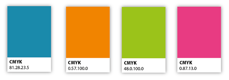
In short, no. A Pantone Colour can be matched using litho printing process; however, more and more printed literature is now made using a digital printing process. Digital printing uses CMYK (Cyan, Magenta, Yellow and Key*), so although the latest digital printing processes can get near, they will not create an exact Pantone Colour match.
If your company has a primary/standard colour, like the red used by Coca-Cola, this can be replicated easier on a digital printing press, outdoor plastic signage and paint. However, some harder-to-match Pantone Colours only have to be one shade out to change the Pantone Colour from one PMS number to another totally different PMS number. Different printing processes will have different effects on the colour.
Another aspect to consider is the medium that you are printing onto. If you print the same colour onto two different stocks of paper, the colour will look different on each stock. It’s the same if you have a tin of gloss coloured paint — you can paint a wall and then paint directly onto brickwork and then onto glass, and on each surface, the colour will be a slightly different shade.
Pantone has two sets of colours for the printing world: coated and uncoated. These two sets of PMS colours have the same ink but show the difference when printed on both a coated stock and a matt stock. Some colours do not look that different, while others change significantly. Once, we had a client that had two Pantone Colours for coated stock and matt stock. This was due to the colours looked most similar to eachother by using two different PMS numbers for each stock… confusing!
*Key is also known now as Black.

If I am not printing a specific Pantone Colour am I downgrading my Brand?
If you need 250 business cards printed for a meeting in a few hours, you cannot have a Pantone Colour printed accurately on a digital printing press. You certainly will get close, but you are not going to match it exactly. It just won’t happen.
Similarly, if you need a poster printed for an event, you can match the colour really closely. So long as you are using a print company with the latest equipment, but once again, you are not going to match it exactly.
An exact Pantone match can only be achieved by mixing the ink and printing the colour separately to everything else (this is also called a spot colour). If you are not having your Pantone Colour printed separately as a spot colour you will have a colour tolerance. Please see in the example below the sort of colour tolerance that I mean.
This colour tolerance will also be the same on a monitor. You can take extensive care matching up your printed literature to your website, but all monitors are different. If you have two brand new monitors next to each other, from different electronic suppliers, the colours on the web page will appear different on each monitor. A red will still be a red and a blue still a blue, but they will have a colour tolerance. If you turn up the contrast or brightness then the colours will change again.
I think of it like this: You walk into an electronics store and see 30 TVs on sale, all lined up, advertising the best quality screens on each TV. All TV’s areshowing the same tennis match, you will notice that each screen will show a slightly different colour green. The cameras that are picking up the feed are the same, the digital TV signal is the same, but every TV will still have a different green lawn to each other, whether it is Sony, Samsung, Toshiba, LG….etc.

So should I pay extra to have a spot colour or Pantone Colour on my print?
Yes, you can do, but the cost of your printing will significantly increase. We print for many corporate clients, large blue chip included, many who are not using spot colours in their literature. We will match the Pantone Colours as closely as we can. Using CMYK either on our litho or digital press will mean that they will not have a 100% Pantone match; unless paying a premium. You can get close using a CMYK makeup, but not exact.
The money they can save far outweighs the benefits of brand recognition. In a larger company these costs can easily run into tens of thousands of pounds, even millions of pounds. Also, the time that it takes for the spot colour printing to be produced is also a factor. This can mean a delay in printed literature being produced and hitting the market.
If you would like any help or advice with print projects please feel free to contact me directly at slewington@printroom.co.uk

Whether you need printed brochures, business cards, posters, presentation folders, annual reports or letterheads, The Printroom Group offer the perfect print solution.
Our clients include blue-chip companies, software companies and charities. We also produce all aspects of school printing and promotional material and work closely with marketing and communication departments in many industries.


Get in touch with our team!
01344 452778
or email hello@printroom.co.uk
If you would like to speak to one of our highly experienced team please contact us.
Get in touch...


