Why is there such a difference in costs for roller banners (or pull-up banners)?
We get asked this question a lot, and with so many companies advertising roller banners (sometimes known as pull-up banners) with such a varied price range, it’s hard to know what you should be paying.
To put it bluntly, you get what you pay for with roller banners.
There are two parts to a roller banner – the mechanism and the printed graphic. So, let’s start with the mechanism.
The base of the roller banner is usually made from aluminium. This can vary in quality – cheaper bases are made with the lightest aluminium and the mechanism inside that holds the banners together is pretty weak, while the more expensive bases are heavier and the mechanism is better made.
With a cheaper base, the graphic can come away from the mechanism inside if opened and closed often or too quickly. This can lead to the graphic either randomly rolling halfway down or snapping off at the bottom when putting the banner up.
The base also houses a pole to keep the graphic straight; again, depending on the cost of the banner, the pole will either be very lightweight or more robust. A cheaper one will bend over time, making your banner look like the Leaning Tower of Pisa. This will then need to be propped up or held up with something heavy to stop it from falling over.
At the top of the graphic, the banner is held to the pole with another strip of aluminium. This can also pull away from the graphic, causing it to snap back really fast. It can catch your fingers or roll back in the mechanism so quickly that you lose the graphic and will have to open it up to find the edge to tape it back.
The second part of the roller banner is the graphic. Again, you always get what you pay for.
Cheaper stands are produced on a flimsy, light banner material. This can crease at the top of the banner or curl at the edges. It will look ok to begin with, but the curling happens after a while.
If you go to a mid-range or higher range roller banner the graphic is either laminated to protect it or printed onto an anti-scuff material that will stay flat.
We use original inks in our machines, so the colour will be vibrant and sharp. However, if you are looking to the cheaper end of the market, graphics can look washed out and jagged around eye edges. Original HP inks are more expensive, but they not only look better, they last longer, because of the ultra violet resistance to sunlight.
I have added some samples below (the company names have been blurred out):
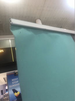
This banner was at a busy airport. You can see that the graphic is so light and cheap that it is all creased and looks like a crumpled piece of paper. If you pull the graphic down, it’s likely that the top bar pulls away in your hand.
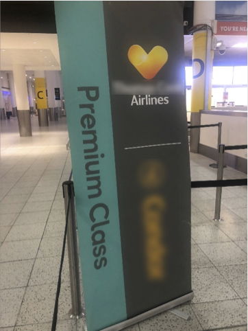
Here is the banner from the front. It looks ok in this picture, but you may be able to see that it’s leaning forward. A child knocks into it and it could come tumbling down. It’s actually advertising a “Premium Class” but looks cheap. So, from a purely marketing perspective, it doesn’t look very Premium and is not really making me want to buy this service.
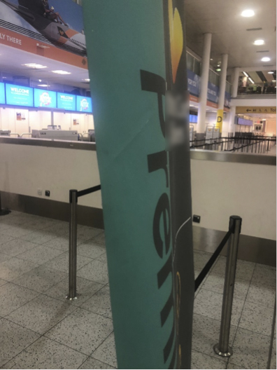
From the side you can see that the graphic is all curled inwards. It’s also very bumpy and not flat.
Because the material is cheap and thin it also has a big crease through it. This is probably where it has fallen over. The material is also not anti-scuff or laminated. It is all dirty and looks generally grubby.
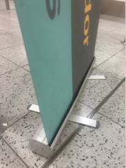
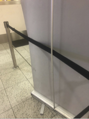
In the left-hand picture, you may be able to see that the base is bent. I wouldn’t know how this has happened, but it does not look good at all.
In the right-hand picture, you will see that the pole is also bent and the roller banner is attached to a barrier – this is to stop it toppling over. However, it still looks like it’s only a matter of time! Health and Safety officer!!
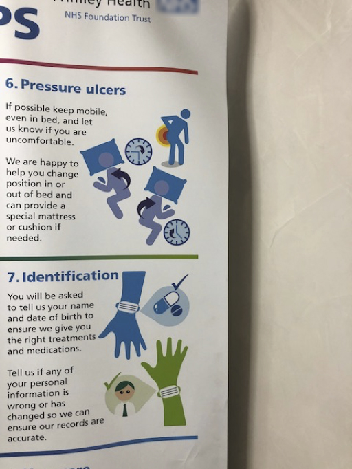
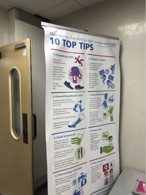
This banner, in another busy public space, is advertising Health and Safety. The graphic is cheap, so it is all warped. It looks like a printed curtain. It’s kind of ironic, too, as this looks like it’s about to fall over.
10 Top Tips on Health and Safety and it falls over and someone trips on the banner? Or it hits a child on the head?
This is the top view. The material is about to fall out of the top bar. It will roll down and the top will go flying. It looks terrible.
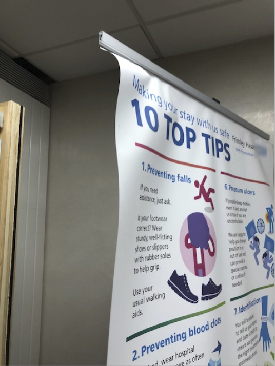
This photo shows the graphic from the side. Notice how it’s all creased and lumpy.
To sum everything up:
You get what you pay for. Pay cheap and, yes, it may be ok for one event, but in the long run it could do more damage to your brand than not having one at all.
All banners look the same on screen; these examples won’t be on a website.
Be aware, that if you do go down the cheaper route it could topple over or break before you have put it up. This is not a good idea at an exhibition.
Remember, other companies may be paying a bit extra, and if they are and you have a cheap banner, it will only make their product, service or brand look more professional than yours.

Whether you need printed brochures, business cards, posters, presentation folders, annual reports or letterheads, The Printroom Group offer the perfect print solution.
Our clients include blue-chip companies, software companies and charities. We also produce all aspects of school printing and promotional material and work closely with marketing and communication departments in many industries.
Get in touch with our team!
01344 452778
or email hello@printroom.co.uk
If you would like to speak to one of our highly experienced team please contact us.
Get in touch...

